

The Number They Don’t Want You to See
When you strip out the noise and compare apples to apples, the myth about charter costs starts to fall apart.

There’s a reason this data isn’t easy to find.
There’s a reason you don’t see it published in one clean place.
And there’s a reason parents are constantly told a story that doesn’t quite match reality.
Because when you put these numbers side by side — really side by side — the narrative starts to crack.
Let’s be clear about what this data actually is.
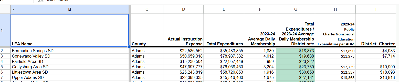
Actual Instruction Expense – what is truly being spent to educate students
Total Expenditures – everything the district spends
Average Daily Membership (ADM) – the real student count
Per-Student Spending (Total ÷ ADM) – the true cost per student
District Charter Rate (Non-Special Ed) – what districts pay for public charter students
And then the key number:
👉 District Spend vs Charter Rate — the difference
Here’s the part they don’t want talked about:
This comparison has nothing to do with special education.
None of it.
This is a clean, straightforward, apples-to-apples look at regular education spending.
And yet…
PDE does not present it this way
Reports avoid putting these numbers directly together
Conversations get redirected back to “complexity” instead of clarity
Why?
Because clarity changes the conversation.
When you divide Total Expenditures by ADM, you get the real per-student cost inside a district.
Not a talking point.
Not a press release number.
The actual cost.
And when you line that up next to the charter tuition rate, something uncomfortable happens:
➡️ The gap becomes visible
➡️ The assumptions fall apart
➡️ The question changes from “Why are charters so expensive?”
➡️ To “Why are we being told that?”
This is exactly why parents are frustrated.
Not because they don’t understand the system…
But because they’re starting to.
And once you see it, you can’t unsee it.
You start asking better questions:
Why isn’t this comparison standard in every report?
Why are we debating pathways instead of outcomes and cost transparency?
Why are the cheapest public schools still the first ones attacked?
This isn’t about picking sides.
This is about telling the truth in plain English.
Parents don’t need a 200-page report.
They need one honest number:
👉 What are we spending per student… and how does that compare?
The data you’re about to see answers that.
And it’s exactly why it’s never presented this way.
Final Thought
If the system worked the way they say it does…
They wouldn’t be afraid of this math.
Call to Action:
📊 Review the full data
📣 Share this with another parent
🏛️ Ask your lawmaker one simple question:
“What is the fully funded per-student rate in my district?”
And don’t let them change the subject.